Data visualization/데이터시각화(R)
데이터시각화 R_ggplot2_Tips 데이터
뉴욕킴
2023. 9. 10. 11:47
1. 라이브러리 불러오기
library(tidyverse)> library(reshape2)
2. 테이블 확인
> head(tips) total_bill tip sex smoker day time size
1 16.99 1.01 Female No Sun Dinner 2
2 10.34 1.66 Male No Sun Dinner 3
3 21.01 3.50 Male No Sun Dinner 3
4 23.68 3.31 Male No Sun Dinner 2
5 24.59 3.61 Female No Sun Dinner 4
6 25.29 4.71 Male No Sun Dinner 43. time 테이블 보기
> table(tips$time)Dinner Lunch
176 68 3-1. 그림으로 표현하기 (변수: time, bar차트로 보기)
> ggplot(tips,aes(time))+geom_bar()
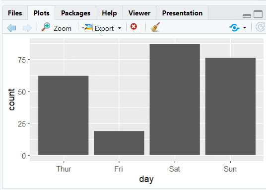
3-2. 날짜별 체크
> ggplot(tips,aes(day))+geom_bar()
3-3. 성별 체크
ggplot(tips,aes(sex))+geom_bar()
3-4. 흡연자별
ggplot(tips,aes(smoker))+geom_bar()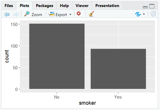
4. tips의 day확인
table(tips$day) Fri Sat Sun Thur
19 87 76 625. TipsDay 변수 만들기
TipsDay = data.frame(day=factor(c("Thur","Fri","Sat","Sun"),levels=c("Thur","Fri","Sat","Sun")),count=c(62,19,87,76))> TipsDay
day count
1 Thur 62
2 Fri 19
3 Sat 87
4 Sun 76> TipsDay$day[1] Thur Fri Sat Sun
Levels: Thur Fri Sat Sun5-1. TipsDay로 시각화
> ggplot(TipsDay,aes(day,count))+geom_bar(stat="identity")- stat="identity" → 있는 그대로 그려줘
- 목,금,토,일 순서대로 나오는 것을 확인
5-2. 최소, 최대값을 자동으로 지정해줌
> ggplot(TipsDay,aes(day,count))+geom_point()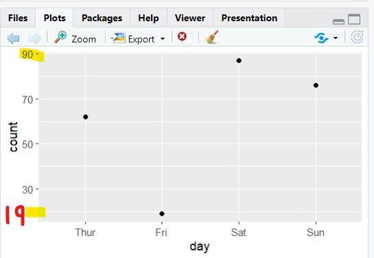
6. fill=day 사용 → day별로 채워라
> ggplot(TipsDay,aes(x="",y=count,fill=day))+geom_bar(stat = "identity")
6-1. coord_polar("y") → y를 동그랗게 만들어줌
> ggplot(TipsDay,aes(x="",y=count,fill=day))+geom_bar(stat = "identity")+coord_polar("y")
7. 요일별 tip 현황 보기
> ggplot(tips,aes(day,tip))+geom_point()
> dim(tips)[1] 244 7→ 244개의 점이 찍혀 있다. (R에는 점들이 겹쳐져 있음)
8. R 시각화
- jittering, geom_jitter() : 자료에 약간의 랜덤 노이즈를 더하여 겹쳐져서 그려지지 않게 하는 방법
> ggplot(tips,aes(day,tip))+geom_jitter()
- boxplots, geom_boxplot() : summary statistics를 이용하여 상자 그림을 그리는 방법
> ggplot(tips,aes(day,tip))+geom_boxplot()
- violin plots, geom_violin()
> ggplot(tips,aes(day,tip))+geom_violin()
# 실무에서 자주 쓰는 그래프
ggplot(tips,aes(day,tip))+geom_violin()+geom_boxplot()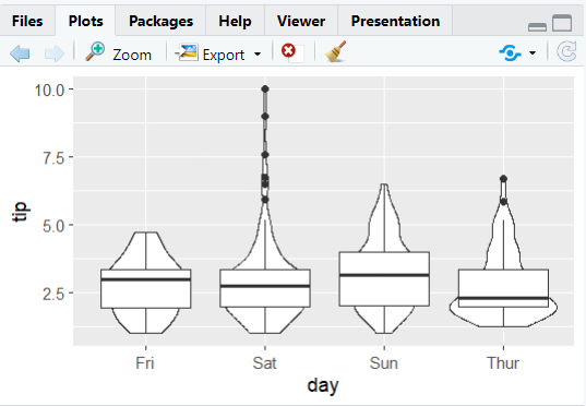
- width = 0.2로 상자의 폭 조절
ggplot(tips,aes(day,tip))+geom_violin()+geom_boxplot(width=0.2)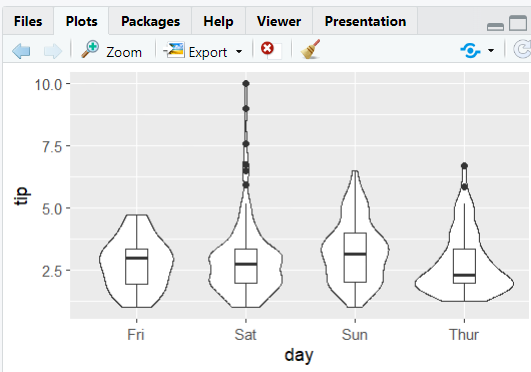
9. 요일별로 total fee 확인
- tips 데이터의 total_bill 추출
> ggplot(tips,aes(total_bill))+geom_freqpoly()
- binwidth = 5로 설정
ggplot(tips,aes(total_bill))+geom_freqpoly(binwidth=5)
→ 부드러운 형태의 그래프로 만들어줌
- 요일별 분포 확인
ggplot(tips,aes(total_bill, color=day))+geom_freqpoly(binwidth=5)
- 아래 면적을 1로 바꾸기
ggplot(tips,aes(total_bill, color=day))+geom_density()
- fill=day 추가
ggplot(tips,aes(total_bill, color=day, fill=day))+geom_density()
- 투명도 조절 : alpha = 0.5 (1: 불투명)
ggplot(tips,aes(total_bill, color=day, fill=day))+geom_density(alpha=0.5)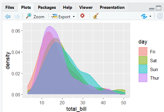
- 히스토그램으로 그리기
ggplot(tips,aes(total_bill))+geom_histogram()
→ 각 bar를 요일별로 표시 (color=day)
ggplot(tips,aes(total_bill, color=day))+geom_histogram()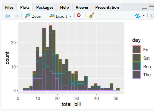
→ fill을 사용하여 명확하게 보이게 수정
ggplot(tips,aes(total_bill, fill=day))+geom_histogram()
→ day별로 쪼개자
ggplot(tips,aes(total_bill,fill=day))+geom_histogram()+facet_wrap(~day)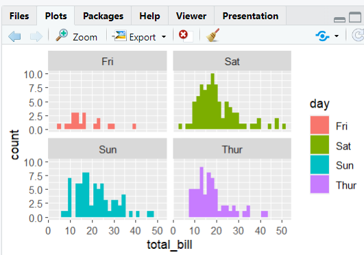
→ 컬럼 숫자를 1로 지정하자 (ncol=1), 피크의 위치 확인 쉬움
ggplot(tips,aes(total_bill,fill=day))+geom_histogram()+facet_wrap(~day, ncol=1)
10. 산점도
ggplot(tips,aes(total_bill,tip))+geom_point()
→ 40불을 먹고도 2.5불을 팁으로 주는 경우 확인
→ 10불을 먹고도 5불 팁을 주는 후한 고객 확인
- geom_smooth()
ggplot(tips,aes(total_bill,tip))+geom_point()+geom_smooth()
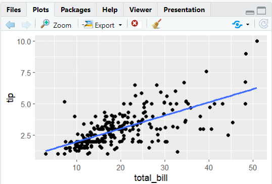
- 직선 모드로 변환 (method="lm")
ggplot(tips,aes(total_bill,tip))+geom_point()+geom_smooth(method="lm")
- span 옵션을 이용하여 local 범위 지정
ggplot(tips,aes(total_bill,tip))+geom_point()+geom_smooth(span=0.1)
- 직선으로 그릴 때
ggplot(tips,aes(total_bill,tip))+geom_point()+geom_smooth(span=1,se=FALSE)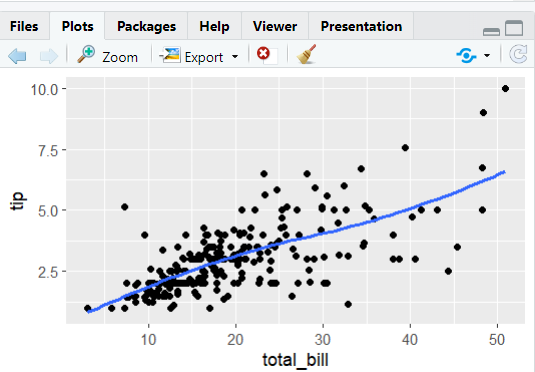
ggplot(tips,aes(total_bill,tip))+geom_point()+geom_smooth(method="lm",se=FALSE)