데이터시각화(R)_nycflights13 Flights
- 라이브러리 불러오기
library(nycflights13)- arrange를 DESC로 역순으로 뽑기
A = flights %>% count(dest) %>% arrange(desc(n))- %>% : 왼쪽의 결과를 오른쪽 함수의 첫 번째 인자로 전달
- count(dest) : flights 데이터셋에서 dest(목적지) 칼럼의 각 값의 빈도수 계산
- %>% arrange(desc(n)): 앞서 계산된 빈도수를 기준으로 내림차순 DESC로 계산
→ flights 데이터셋에서 각 목적지별 비행 횟수를 계산하고, 결과를 비행 순서가 많은 순서대로 정렬
- 편수가 많은 20개만 추출하여 확인
A %>%
  head(n=20) %>%
  ggplot()+geom_bar(aes(dest,n),stat="identity")
→ flights 데이터셋에서 각 목적지별 비행 횟수를 계산하고, 그 결과를 비행 횟수가 많은 순서대로 정렬하여 A 변수에 저장

- N의 역순으로 진행: dest,-n
A %>%
  head(n=20) %>%
  ggplot()+geom_bar(aes(reorder(dest,-n),n),stat="identity")
- 목적지가 ORD거나 MDW 인 것을 추출
flights %>%
  filter(dest=='ORD'|dest=="MDW")
# A tibble: 21,396 × 19
year month day dep_time sched_dep_time dep_delay
<int> <int> <int> <int> <int> <dbl>
1 2013 1 1 554 558 -4
2 2013 1 1 558 600 -2
3 2013 1 1 608 600 8
4 2013 1 1 629 630 -1
5 2013 1 1 656 700 -4
6 2013 1 1 709 700 9
7 2013 1 1 715 713 2
8 2013 1 1 739 745 -6
9 2013 1 1 749 710 39
10 2013 1 1 828 830 -2
# ℹ 21,386 more rows
# ℹ 13 more variables: arr_time <int>,
# sched_arr_time <int>, arr_delay <dbl>, carrier <chr>,
# flight <int>, tailnum <chr>, origin <chr>, dest <chr>,
# air_time <dbl>, distance <dbl>, hour <dbl>,
# minute <dbl>, time_hour <dttm>
# ℹ Use `print(n = ...)` to see more rows- 많은 내용을 써야될 때: %in% 사용
Chicago = flights %>% filter(dest %in% c("ORD","MDW"))- flights 데이터셋에서 dest(목적지) 컬럼의 값이 'ORD'나 'MDW'인 행만 선택하는 필터링 작업
→ 시카고로 가는 비행기 정보만 담긴 새로운 데이터 프레임 생성
Chicago %>% count(dest) %>%
  ggplot()+geom_bar(aes(dest,n),stat = "identity")
- dep_delay 와 arr_delay 관계 살펴보기
Chicago %>% ggplot(aes(dep_delay,arr_delay))+geom_point()
- 시카고 전체의 출발지연, 도착지연 현황 추출
Chicago %>% ggplot(aes(dep_delay,arr_delay))+geom_point(alpha=0.3)
- intercept=0: 직선의 절편
- slope=1은 직선의 기울기를 설정
Chicago %>%
 ggplot(aes(dep_delay,arr_delay))+
 geom_point(alpha=0.3,size=0.3)+
 geom_abline(interdept=0,slope=1,color="white",linewidth=2)
- 라인 아래: 출발 지연이 있었지만 따라 잡아서 늦지 않음
- 라인 위: 출발 지연, 도착 지연 모두 있음
- geom_abline(intercept=0, slope=1, color="white", linewidth=2): 이 부분은 그래프에 직선(y = x)을 추가하는 작업을 수행합니다(즉, 출발 지연 시간이 도착 지연 시간과 같다는 가정). 여기서 intercept=0와 slope=1은 직선의 절편과 기울기를 설정하며, color="white"와 linewidth=2는 직선의 색상과 두께를 설정
→ Chicago 데이터셋에서 출발 지연 시간과 도착 지연 시간 간의 관계를 살펴보고자 함
- 300*300씩 잘라서 그래프 잘보이게 다시 시각화
Chicago %>%
  ggplot(aes(dep_delay,arr_delay))+
  geom_point(alpha=0.3,size=0.5)+
  geom_abline(interdept=0,slope=1,color="white",linewidth=2)+
  xlim(NA,300)+ylim(NA,300)
→ 출발 시 지연되면 열심히 가도 따라잡는데 한계가 있다.
- 도착지 별로 잘라서 추출: facet_wrap(~dest)
Chicago %>%
  ggplot(aes(dep_delay,arr_delay))+
  geom_point(alpha=0.3,size=0.5)+
  geom_abline(interdept=0,slope=1,color="white",linewidth=2)+
  xlim(NA,300)+ylim(NA,300)+facet_wrap(~dest)
→ 상대적으로 ORD가 변동폭이 더 커보임
- 월별 추세 확인
Chicago %>%
  ggplot(aes(dep_delay,arr_delay))+
  geom_point(alpha=0.3,size=0.5)+
  geom_abline(intercept=0,slope=1,color="white",linewidth=2)+
  xlim(NA,300)+ylim(NA,300)+facet_wrap(~month)
- intercept=0
: 직선의 절편
- slope=1은 직선의 기울기를 설정

→ 4,5,7월이 변동폭이 상대적으로 큼 (성수기 시즌)
- 부드러운 추세선 추가
Chicago %>%
  ggplot(aes(dep_delay,arr_delay))+
  geom_point(alpha=0.3,size=0.5)+
  #geom_abline(intercept=0,slope=1,color="white",linewidth=2)+
  geom_smooth(linewidth=2)+
  xlim(NA,300)+ylim(NA,300)+facet_wrap(~month)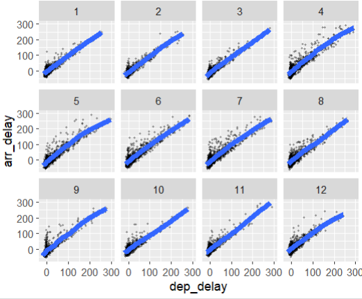
- Chicago %>% ggplot(aes(dep_delay, arr_delay)): 여기서 %>%는 파이프 연산자로, 왼쪽의 결과를 오른쪽 함수의 첫 번째 인자로 전달합니다. ggplot(aes(dep_delay, arr_delay)) 함수는 'Chicago' 데이터셋에서 'dep_delay'(출발 지연 시간)와 'arr_delay'(도착 지연 시간) 컬럼을 각각 x축과 y축으로 설정하고 그래프를 생성하는 작업을 시작합니다.
+ geom_point(alpha=0.3, size=0.5): 이 부분은 앞서 설정된 x축과 y축 값을 바탕으로 산점도를 그리는 작업을 수행합니다. 여기서 alpha=0.3은 점들의 투명도를 설정하고, size=0.5은 점들의 크기를 설정합니다.
+ geom_smooth(linewidth=2): 이 부분은 그래프에 데이터 포인트들 사이에 부드러운 추세선(스무딩 곡선)을 추가하는 작업을 수행합니다.linewidth=2는 선의 두께를 설정합니다.
+ xlim(NA, 300)+ylim(NA, 300): 이 부분은 x축과 y축의 범위를 각각 최대 300까지 제한하는 작업을 수행합니다.
+ facet_wrap(~month): 이 부분은 데이터셋에서 월(month)별로 그래프가 나눠져 표시되게 하는 것입니다.
→ 'Chicago' 데이터셋에서 출발 지연 시간과 도착 지연 시간 간의 관계와 추세선을 월별로 살펴보고자 하는 것입니다.
- Y를 X로 하얀선으로 그리고, Linear 모델로 보기
Chicago %>%
  ggplot(aes(dep_delay,arr_delay))+
  geom_point(alpha=0.3,size=0.5)+
  geom_abline(intercept=0,slope=1,color="red",linewidth=2)+
  geom_smooth(method="lm",linewidth=2)+
  xlim(NA,100)+ylim(NA,100)+facet_wrap(~month)
→ 기울기는 차이가 나지 않음
- 항공편 확인
Chicago %>% count(month)# A tibble: 12 × 2
month n
<int> <int>
1 1 1609
2 2 1513
3 3 1690
4 4 1757
5 5 1931
6 6 1887
7 7 1929
8 8 1954
9 9 1921
10 10 1960
11 11 1699
12 12 1546→ 5~9월은 항공편이 많다.
231104
- 비행 중 발생한 delay 분포
Chicago %>% mutate(pure_delay = arr_delay-dep_delay) %>%
 ggplot(aes(pure_delay))+geom_histogram()
flights %>% mutate(pure_delay = arr_delay-dep_delay) %>%
 ggplot(aes(pure_delay))+geom_histogram()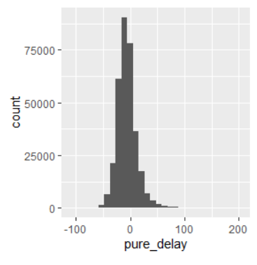
flights %>% mutate(pure_delay = arr_delay-dep_delay) %>%
 ggplot(aes(distance,pure_delay))+geom_point(alpha=0.2,size=0.2)+
 geom_smooth()+xlim(0,3000)

flights %>% mutate(pure_delay = arr_delay-dep_delay) %>%
 ggplot(aes(month,pure_delay))+geom_jitter(alpha=0.2,size=0.2)+
 geom_smooth()
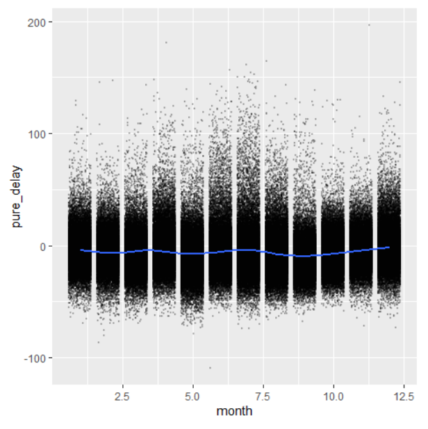
- 가을에 비행기들이 과속하는 것을 알 수 있음
flights %>% transmute(pure_delay = arr_delay-dep_delay,
 date = as.Date(paste(year,month,day,sep="-"))) %>%
 ggplot(aes(date,pure_delay))+geom_jitter(alpha=0.2,size=0.2)+
 geom_smooth()
- pure_delay>60 / date 별로 그룹 진행
- 대용량 자료 다룰 때 : 미싱 건 방지 → na.rm=TRUE
flights %>% transmute(pure_delay = arr_delay-dep_delay,
 date = as.Date(paste(year,month,day,sep="-")))%>%
 group_by(date) %>%
 summarize(n = sum(pure_delay>60,na.rm=TRUE)) %>%
 ggplot(aes(date,n))+geom_line()
- 여름, 봄, 겨울에 몰려 있음
flights %>% transmute(pure_delay = arr_delay-dep_delay,
 date = as.Date(paste(year,month,day,sep="-")))%>%
 group_by(date) %>%
 summarize(n = sum(pure_delay>60,na.rm=TRUE)) %>%
 filter(n>50)
- 일별 비행 건수
AA = flights %>%
 transmute(date = as.Date(paste(year,month,day,sep="-")))%>%
 group_by(date) %>%
 summarize(n = n())
AA %>%
 ggplot(aes(date,n))+geom_line()
AA %>% arrange(desc(n)) %>% print(n=10)
- 낮은 순서대로 보기
AA %>% arrange(n) %>% print(n=10)
- weekdays 함수를 이용해 요일 뽑아냄
BB=AA %>% mutate(weekday = weekdays(date,abbreviate=TRUE),
 weekday = factor(weekday,
 levels=c("Mon","Tue","Wed","Thu",
 "Fri","Sat","Sun")),
 week = as.numeric(date-as.Date("2012-12-31"))%/%7+1)
BB%>%
 ggplot(aes(weekday,n))+geom_line(aes(group=week))
BB %>% filter(weekday=="Thu", n<800)
BB %>% filter(weekday=="Tue", n>850,n<910)
* 참고자료
RPubs - ch10_relational_data_dplyr
RPubs - ch10_relational_data_dplyr
rpubs.com