데이터시각화(R)_탐색적 자료분석 EDA
탐색적 자료분석 (EDA)
EDA 의 단계
1. 자료에 대하여 궁금한 질문 사항들 정리
2. 자료 시각화, 변형, 그리고 모델링등의 탐색을 통해 질문들에 대한 답을 찾기
3. 탐색 결과를 이용하여 질문 사항들을 구체화하거나 새로운 질문 사항들 만들기
• EDA 과정은 자료분석의 가장 중요한 단계
• 자료정리, 자료 시각화, 자료 변형, 자료 모형화 등이 포함
EDA 의 목표
자료에 대한 이해를 위한 것
• EDA 를 위한 일반적인 질문 – What type of variation occurs within my variables? – What type of covariation occurs between my variables?
• variable: 측정할 수 있는 것, 변수
• value: 측정한 값
• observation: 비슷한 환경에서 하나의 개체로 부터 측정된 값들의 집합
• Tabular data: 변수와 관측으로 이루어진 값들의 집합
• tidy : column 은 변수를, row 는 관측을 의미하며 column 과 row 로 구성되는 cell 에는 값을 가지고 있는 형태로 정리된 tabular data
분포 시각화
1) 범주형 변수: bar chart 이용
ggplot(data = diamonds) +
 geom_bar(mapping = aes(x = cut))

- cut에 대한 분포 확인
diamonds %>% group_by(cut) %>% count() cut n
<ord> <int>
1 Fair 1610
2 Good 4906
3 Very Good 12082
4 Premium 13791
5 Ideal 21551→ diamonds 데이터셋을 cut 변수를 기준으로 그룹화하고, 각 컷별로 데이터셋에 포함된 다이아몬드의 개수를 계산하는 작업을 수행
2) 연속형 변수: histogram 이용
ggplot(data = diamonds) +
  geom_histogram(mapping = aes(x = carat), binwidth = 0.5)
- ggplot2::cut_width()로 범주화 한후 dplyr::count()를 이용하여 histogram 의 높이 계산 가능
diamonds %>%
 count(cut_width(carat, 0.5))
`cut_width(carat, 0.5)` n
<fct> <int>
1 [-0.25,0.25] 785
2 (0.25,0.75] 29498
3 (0.75,1.25] 15977
4 (1.25,1.75] 5313
5 (1.75,2.25] 2002
6 (2.25,2.75] 322
7 (2.75,3.25] 32
8 (3.25,3.75] 5
9 (3.75,4.25] 4
10 (4.25,4.75] 1
11 (4.75,5.25] 1
- zooming: filter() 와 binwidth 이용
smaller <- diamonds %>%
 filter(carat < 3)

ggplot(data = smaller, mapping = aes(x = carat)) +
 geom_histogram(binwidth = 0.1)
- 연속형 변수: freqpoly() 이용
ggplot(data = smaller, mapping = aes(x = carat, colour = cut)) +
 geom_freqpoly(binwidth = 0.1)
- y 의 범위가 60 까지 되어 있으나 10 에서 60 사이에는 자료가 거의 보이지 않음
- coord_cartesian()의 ylim 옵션을 이용하여 zooming 하여 살펴보기
ggplot(diamonds) +
 geom_histogram(mapping = aes(x = y), binwidth = 0.5) +
 coord_cartesian(ylim = c(0, 50))
- coord_cartesian(ylim = c(0, 50)): coord_cartesian 함수를 사용하여 y축의 범위를 0부터 50까지로 제한합니다. 이를 통해 y축의 표시 범위를 조정
→ diamonds 데이터셋을 사용하여 y 변수에 대한 히스토그램을 그리고, y축의 범위를 0부터 50까지로 제한하는 작업을 수행
이상점
- diamonds의 y에 대한 histogram 그리기
ggplot(diamonds) +
 geom_histogram(mapping = aes(x = y), binwidth = 0.5)

summary(diamonds$y)summary(diamonds$y)
Min. 1st Qu. Median Mean 3rd Qu. Max.
0.000 4.720 5.710 5.735 6.540 58.900
- y 의 범위가 60 까지 되어 있으나 10 에서 60 사이에는 자료가 거의 보이지 않음.
*coord_cartesian()의 ylim 옵션을 이용하여 zooming 하여 살펴보기
ggplot(diamonds) +
 geom_histogram(mapping = aes(x = y), binwidth = 0.5) +
 coord_cartesian(ylim = c(0, 50))
이상점 처리 방법
1) 이상점이 있는 관측을 모두 삭제 - 바람직하지 않음
diamonds2 <- diamonds %>%
 filter(between(y, 3, 20))
2) 이상한 값만 NA 로 처리
diamonds2 <- diamonds %>%
 mutate(y = ifelse(y < 3 | y > 20, NA, y))
ggplot(data = diamonds2, mapping = aes(x = x, y = y)) +
 geom_point()
- na.rm = TRUE 옵션 이용
ggplot(data = diamonds2, mapping = aes(x = x, y = y)) +
 geom_point(na.rm = TRUE)
- na.rm 매개변수를 TRUE로 설정하여 결측값을 제외한 데이터만 포인트로 표시
- cancel 된 비행기와 cancel 되지 않은 비행기의 scheduled departure time 별 비교
nycflights13::flights %>%
 mutate(
 cancelled = is.na(dep_time),
 sched_hour = sched_dep_time %/% 100,
 sched_min = sched_dep_time %% 100,
 sched_dep_time = sched_hour + sched_min / 60
 ) %>%
 ggplot(mapping = aes(sched_dep_time)) +
 geom_freqpoly(mapping = aes(colour = cancelled), binwidth = 1/4)

→ nycflights13 패키지의 flights 데이터셋을 사용하여 새로운 변수를 추가한 후, sched_dep_time을 x축으로 하여 빈도 다각형을 그리는 작업을 수행합니다. cancelled 변수에 따라 다른 색상으로 표시되며, 막대 폭은 1/4로 설정
Covariation
• 변수들 간의 관계를 나타내는 것으로 둘 이상의 변수들이 함께 변하는 경향을 파악하는 것이 필요
범주형과 연속형 변수 간의 관계
• 범주의 수준별로 나누어 연속형 변수의 분포 살펴보기
• geom_freqpoly 를 이용하는 경우
ggplot(data = diamonds, mapping = aes(x = price)) +
 geom_freqpoly(mapping = aes(colour = cut), binwidth = 500)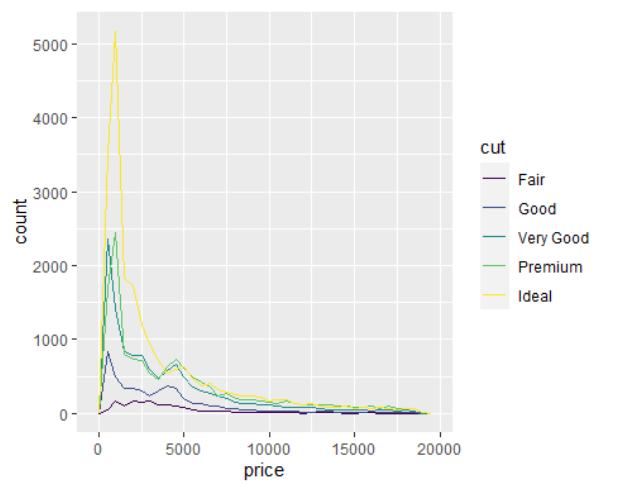
→ 위의 그림에서 범주의 수준간 차이를 알아보기 힘든 이유는 수준간 관측수가 다르기 때문
ggplot(diamonds) +
 geom_bar(mapping = aes(x = cut))

- geom_density 이용하여 비교하기
ggplot(data = diamonds, mapping = aes(x = price, y = after_stat(density))) +
 geom_freqpoly(mapping = aes(colour = cut), binwidth = 500)
- geom_boxplot()으로 비교하기
ggplot(data = diamonds, mapping = aes(x = cut, y = price)) +
 geom_boxplot()

- reorder() 를 이용하여 범주 순서를 y 값의 크기에 따라 바꾸어 그리기
ggplot(data = mpg, mapping = aes(x = class, y = hwy)) +
 geom_boxplot()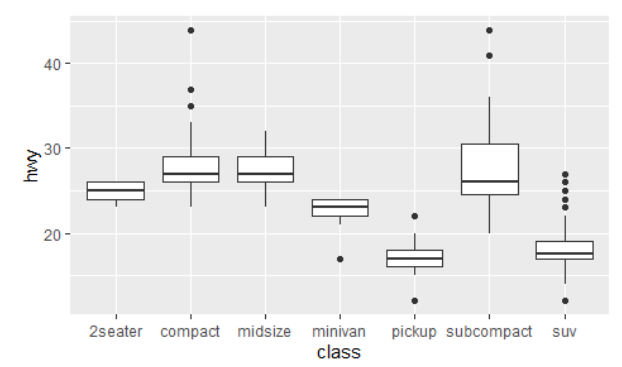
ggplot(data = mpg) +
 geom_boxplot(mapping = aes(x = reorder(class, hwy, FUN = median), y = hwy))
- geom_boxplot(mapping = aes(x = reorder(class, hwy, FUN = median), y = hwy))
→ 상자 그림을 추가합니다. x 축에는 class 변수를 중앙값(hwy를 기준으로)에 따라 재정렬한 값을 매핑하고, y 축에는 hwy 변수를 매핑
- coord_flip()을 이용하여 축 위치 바꾸기
ggplot(data = mpg) +
 geom_boxplot(mapping = aes(x = reorder(class, hwy, FUN = median), y = hwy)) +
 coord_flip()

두 범주형 변수의 관계
- geom_count()를 이용하여 관측수를 점 크기로 표시
ggplot(data = diamonds) +
 geom_count(mapping = aes(x = cut, y = color))
- dplyr::count 를 이용하여 계산하기
diamonds %>%
 count(color, cut)
- geom_tile()과 fill aesthetic 을 이용하여 표현하기
diamonds %>%
 count(color, cut) %>%
 ggplot(mapping = aes(x = color, y = cut)) +
 geom_tile(mapping = aes(fill = n))
두 연속변수의 관계
- geom_point()를 이용한 산점도
ggplot(data = diamonds) +
 geom_point(mapping = aes(x = carat, y = price))
- alpha 옵션을 이용하여 투명도 조정
ggplot(data = diamonds) +
 geom_point(mapping = aes(x = carat, y = price), alpha = 1 / 100)
- bin 을 이용 : geom_bin2d() → 2차원 히스토그램 추가, geom_hex()
ggplot(data = smaller) +
 geom_bin2d(mapping = aes(x = carat, y = price))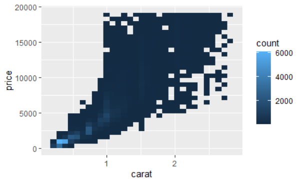
- 한 연속변수를 cut_width 로 범주화하여 geom_boxplot 이용
ggplot(data = smaller, mapping = aes(x = carat, y = price)) +
 geom_boxplot(mapping = aes(group = cut_width(carat, 0.1)))
- carat이 증가하면 price가 증가하지만, 2 carat이 넘어가면 증가 폭은 낮다.
- cut_number()를 이용하여 범주화 : 자료의 수가 일정하게 해줌
ggplot(data = smaller, mapping = aes(x = carat, y = price)) +
 geom_boxplot(mapping = aes(group = cut_number(carat, 20)))
- cut_number(carat, 20) → carat 변수를 20개의 구간으로 나눠 그룹을 형성
→ smaller 데이터셋을 사용하여 carat 변수와 price 변수를 가지고 상자 그림을 그리는 작업을 수행합니다. carat 변수를 20개의 구간으로 나누어 각 그룹에 대한 상자 그림을 그림
Patterns and models
ggplot(data = faithful) +
 geom_point(mapping = aes(x = eruptions, y = waiting))
- model 을 이용한 패턴 분석
– diamonds 자료에서 cut 과 price 의 관계의 파악이 어려움
– cut 과 carat, carat 과 price 간의 관계 때문
– price 와 carat 의 관계를 제외하고 cut 과 price 관계를 파악
library(modelr)
mod <- lm(log(price) ~ log(carat), data = diamonds)
diamonds2 <- diamonds %>%
 add_residuals(mod) %>%
 mutate(resid = exp(resid))
ggplot(data = diamonds2) +
 geom_point(mapping = aes(x = carat, y = resid))
- mod <- lm(log(price) ~ log(carat), data = diamonds): diamonds 데이터셋을 사용하여 선형 회귀 모델을 적합시킵니다. 종속 변수는 price의 로그 값이고, 독립 변수는 carat의 로그 값입니다. 모델은 mod 객체에 저장
- diamonds2 <- diamonds %>% add_residuals(mod) %>% mutate(resid = exp(resid)): diamonds 데이터셋에 대한 예측값과 잔차를 계산합니다. add_residuals() 함수를 사용하여 예측값과 잔차를 추가하고, mutate() 함수를 사용하여 잔차 값을 로그의 역함수인 지수로 변환합니다. 결과는 diamonds2 데이터셋에 저장
- ggplot(data = diamonds2) + geom_point(mapping = aes(x = carat, y = resid)): diamonds2 데이터셋을 사용하여 ggplot 객체를 생성하고, geom_point() 함수를 사용하여 산점도를 추가합니다. x 축에는 carat 변수를, y 축에는 변환된 잔차(resid) 값을 매핑
→ diamonds 데이터셋을 사용하여 로그-로그 선형 회귀 모델을 적합하고, 예측값과 변환된 잔차를 계산한 후, carat 변수와 잔차 값을 가지고 산점도를 그리는 작업을 수행합니다.
- cut 이 좋아질수록 price(carat 보정후)가 높아짐
ggplot(data = diamonds2) +
 geom_boxplot(mapping = aes(x = cut, y = resid))